Project Context
The confectionery market was changing with new formats of 'confectionery selling' both online through websites and social channels, as well as resurgence in independent stores. The consumer buying habits were also changing as many people's disposable income had reduced. A lot of demand had moved towards gifting and premium products, but ultimately within the connected digital world much is now influenced by branding and advertising.
Hancocks Cash & Carry is one of the UK's leading confectionery wholesalers, but after years of trading, the branding was dated. A lack of strategy and consistency throughout the stores was hampering sales, and customer loyalty was dwindling.
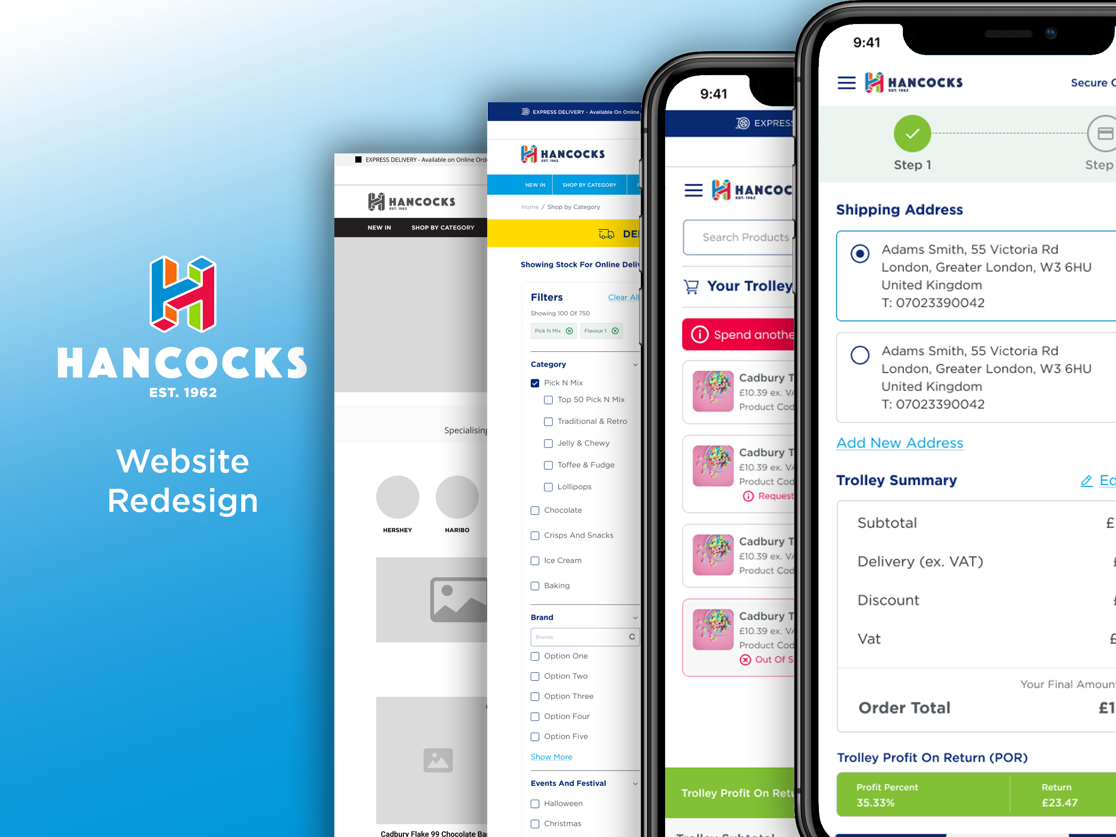
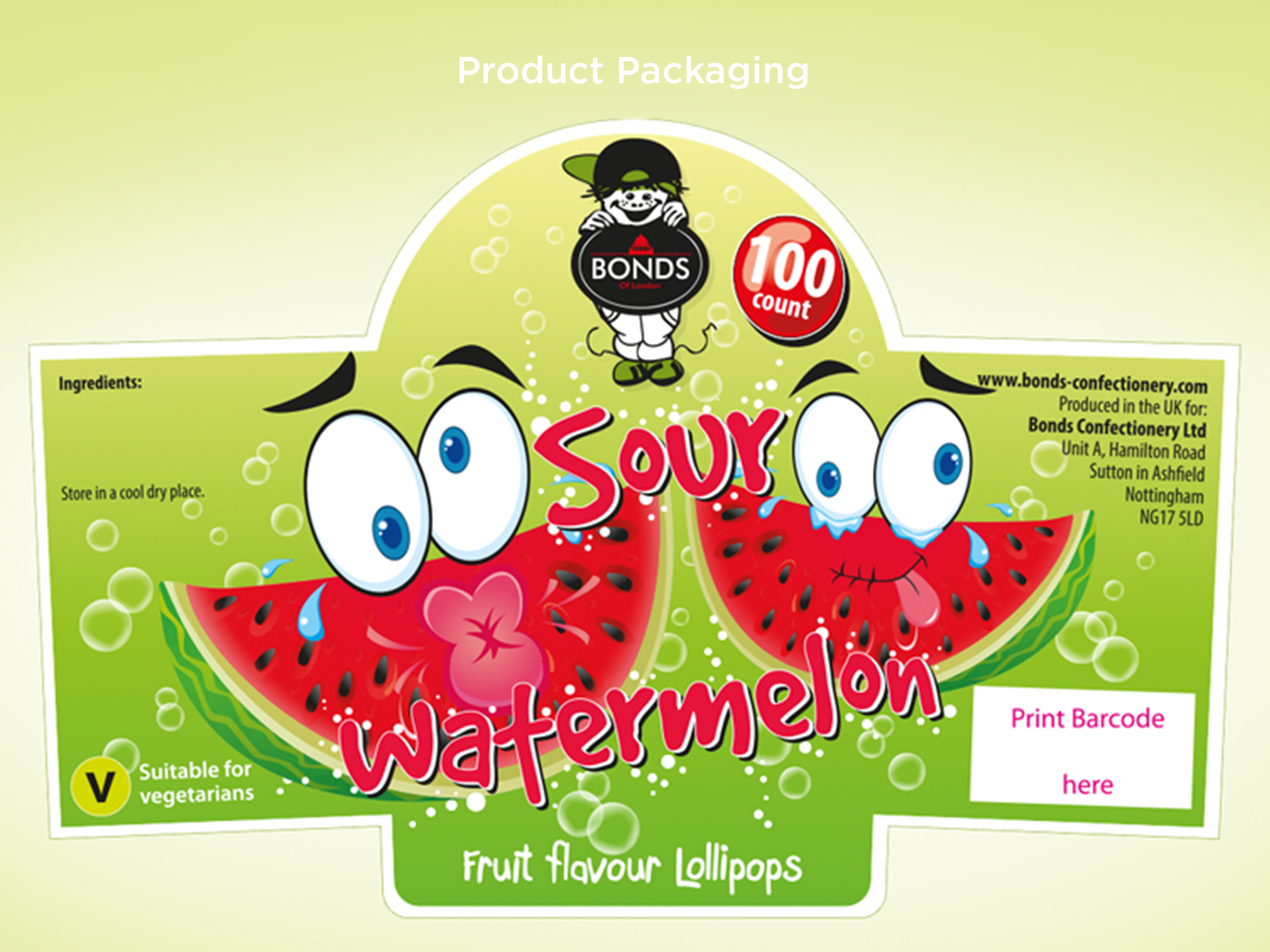
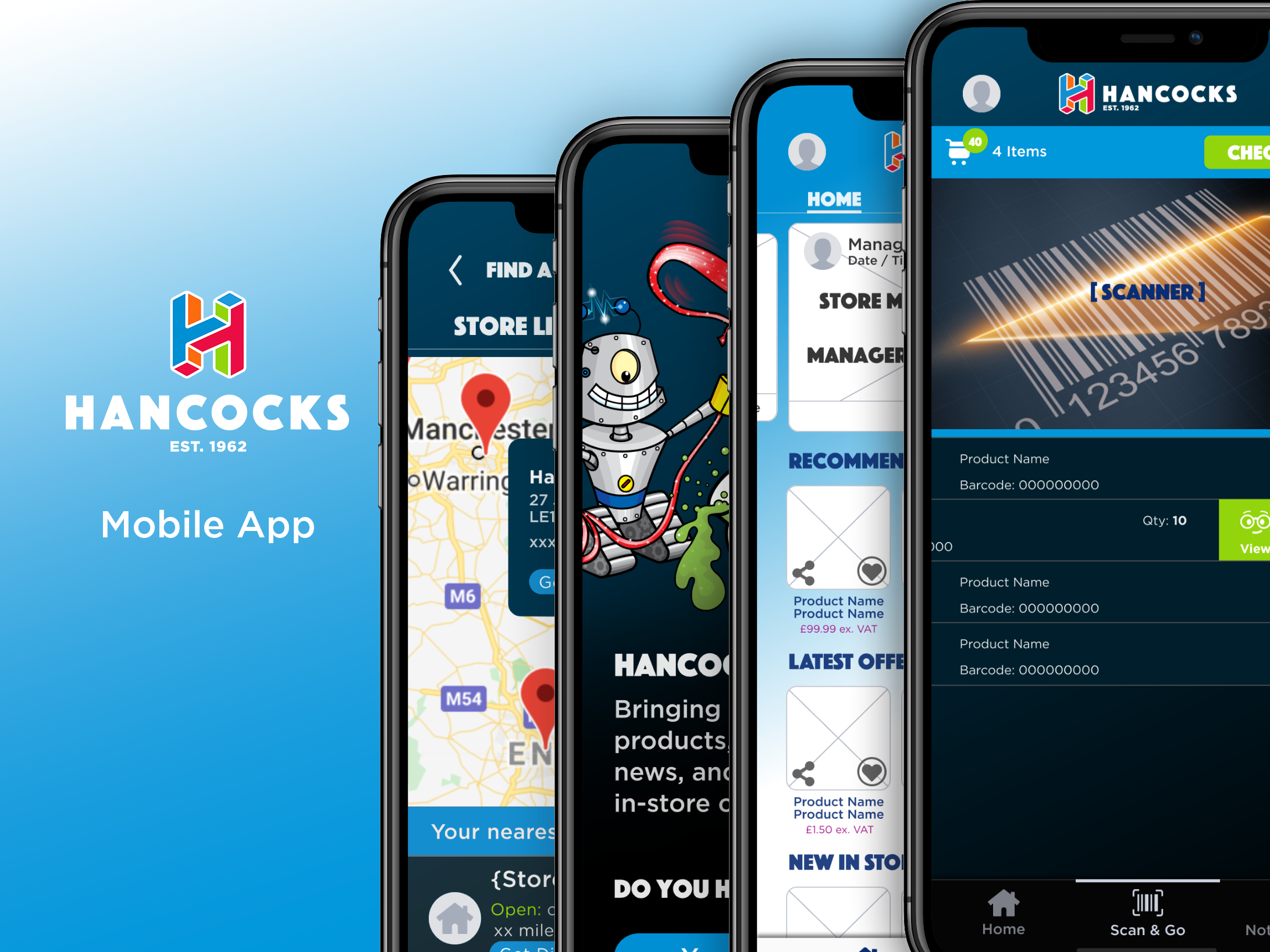
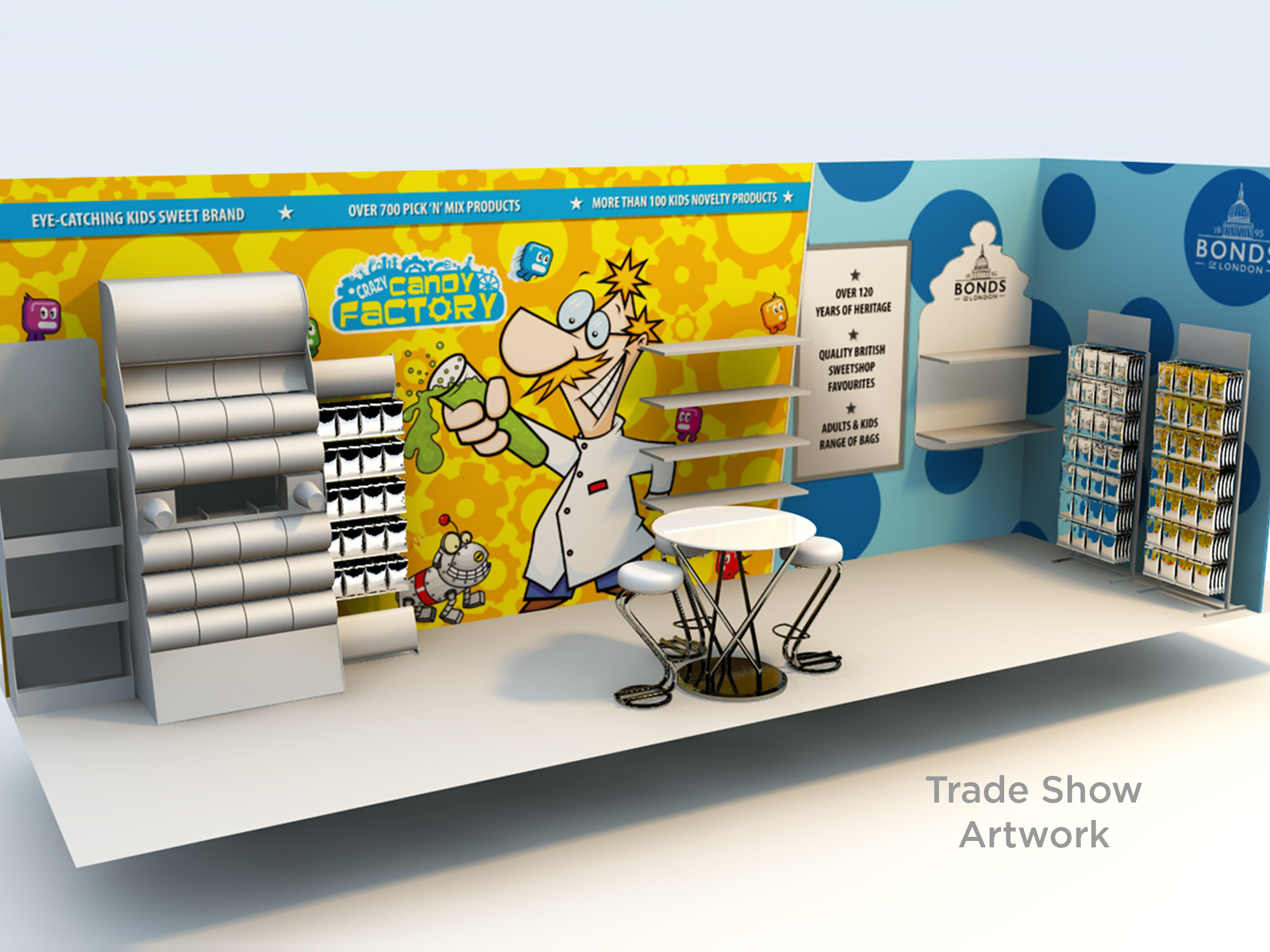
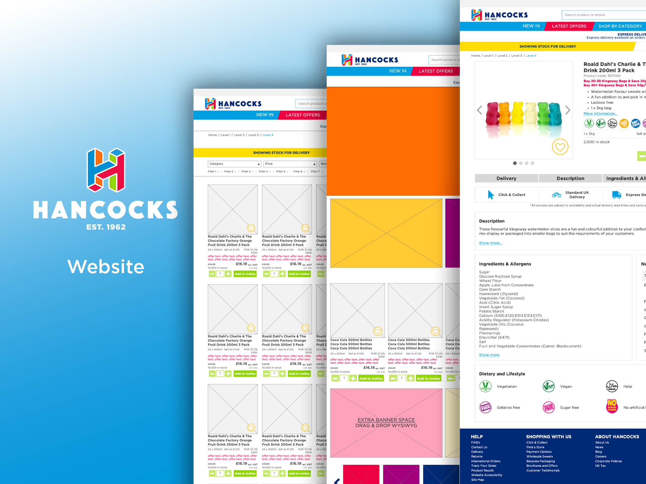
I was tasked with supporting the Hancocks rebrand, liaising with an external brand agency, to create both assets for in-store activation, digital content, and rebranding their website.
Key Insights
As part of the Hancocks rebrand project research was carried out both internally and externally by the brand agency to identify customer sentiment, their understanding about Hancocks heritage and expertise, as well as if they were aware of the full range of products and services on offer. On top of this it was crucial to research the market conditions, competition and what areas of focus would be beneficial in fulfilling the customer needs and growing strength and awareness in the brand.
- Customers believed the Hancocks branding to be dull.
- Stores are considered unorganised and inconsistent with focus being too heavily on being a trader instead of a brand.
- Confidence in brand expertise was dwindling as there was less focus on identifying new products and innovations.
- An ever-increasing number of brands are vying for customers attention whilst disposable income is reduced.
- More people are buying confectionery online.
- The consumer space is crowded with confectionery available everywhere. This has increased the demand for high standards and premium offerings.
Design Requirements
After talking with the Hancocks Marketing Director and the external brand agency, we set the goals to put the humanity, joy and theatre back into the Hancocks brand. This included making the brand vibrant and attractive to customers, whilst really showcasing their expertise in innovation within the market.
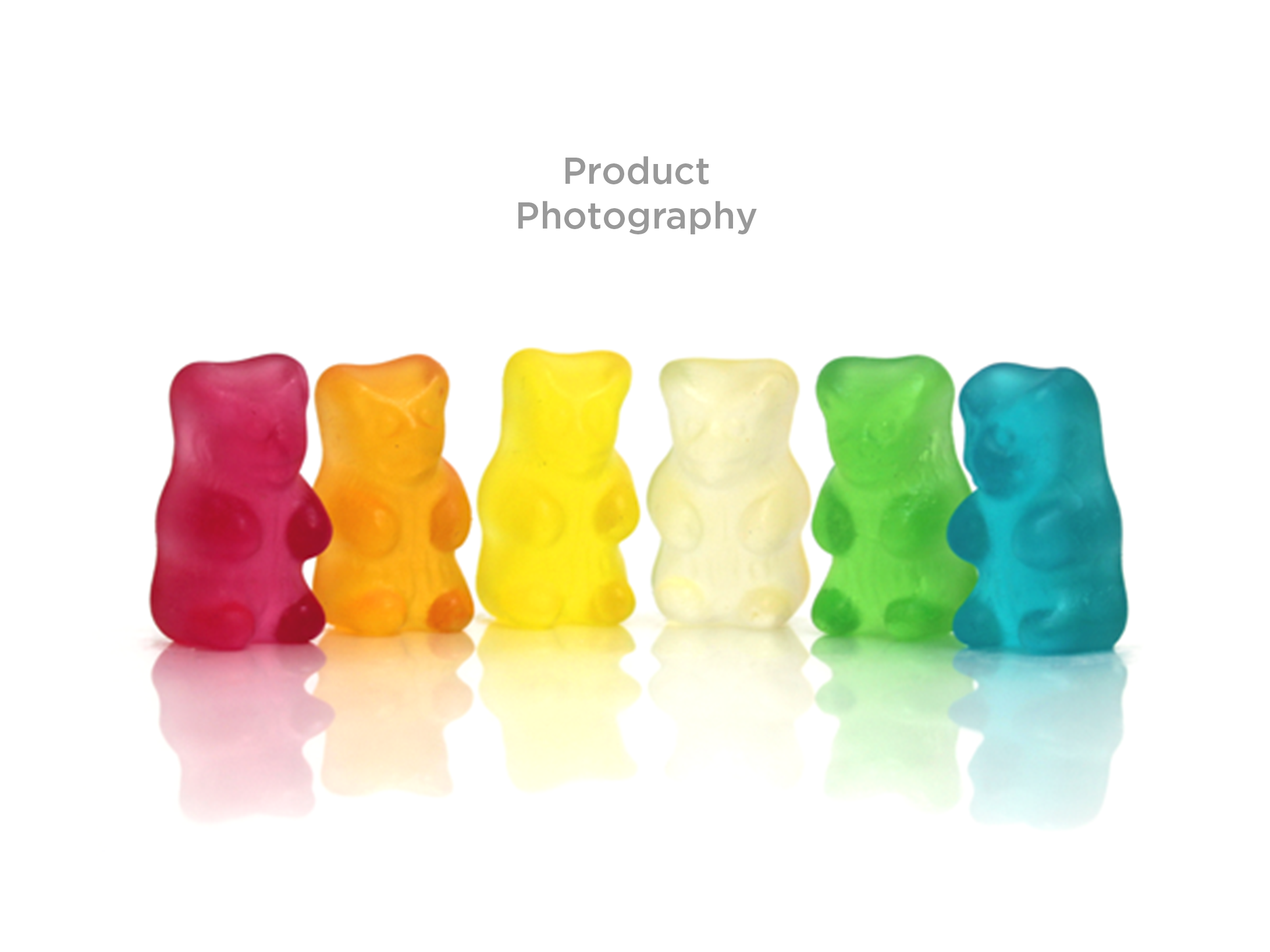
1. Consider the bright colourful nature of confectionery and bring that to life within the company branding.
2. Create a strong brand identity and visual language.
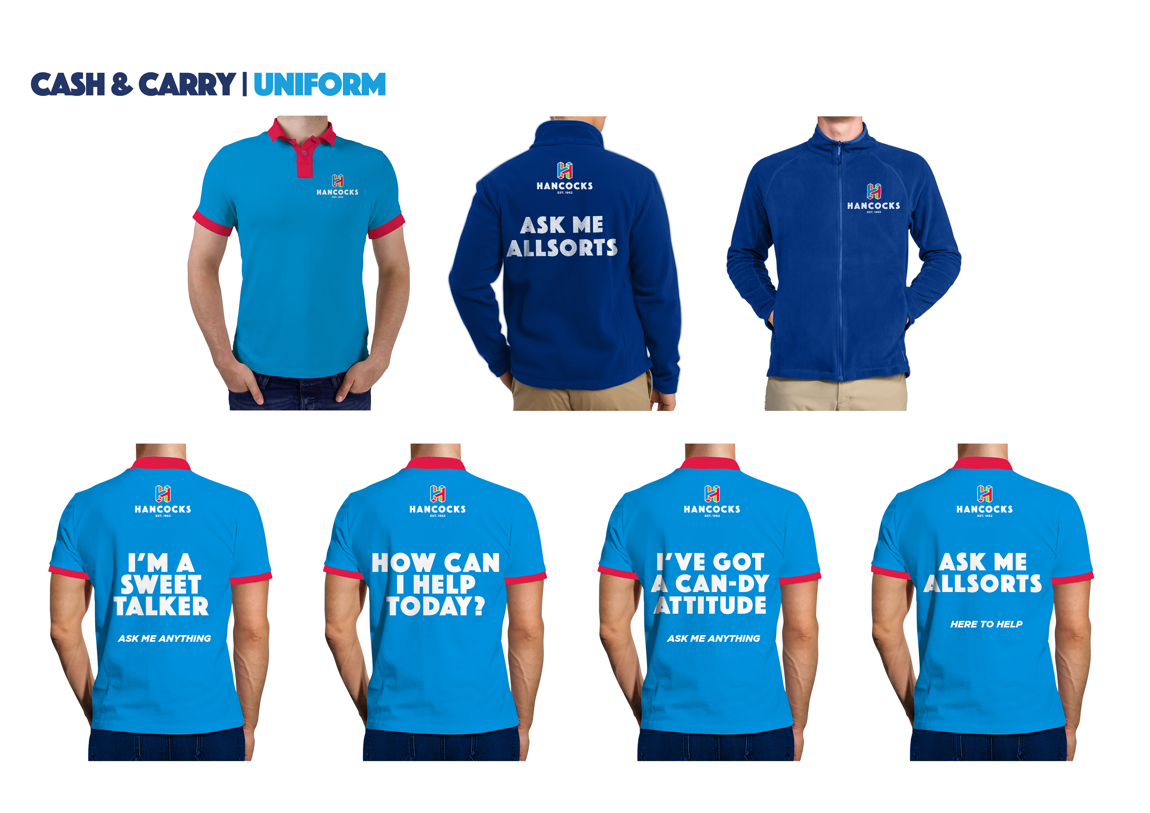
3. Bring passion and pride to the employees. Encourage them to highlight their expertise in confectionery, offering support and engaging with customers. This helps show that they care.
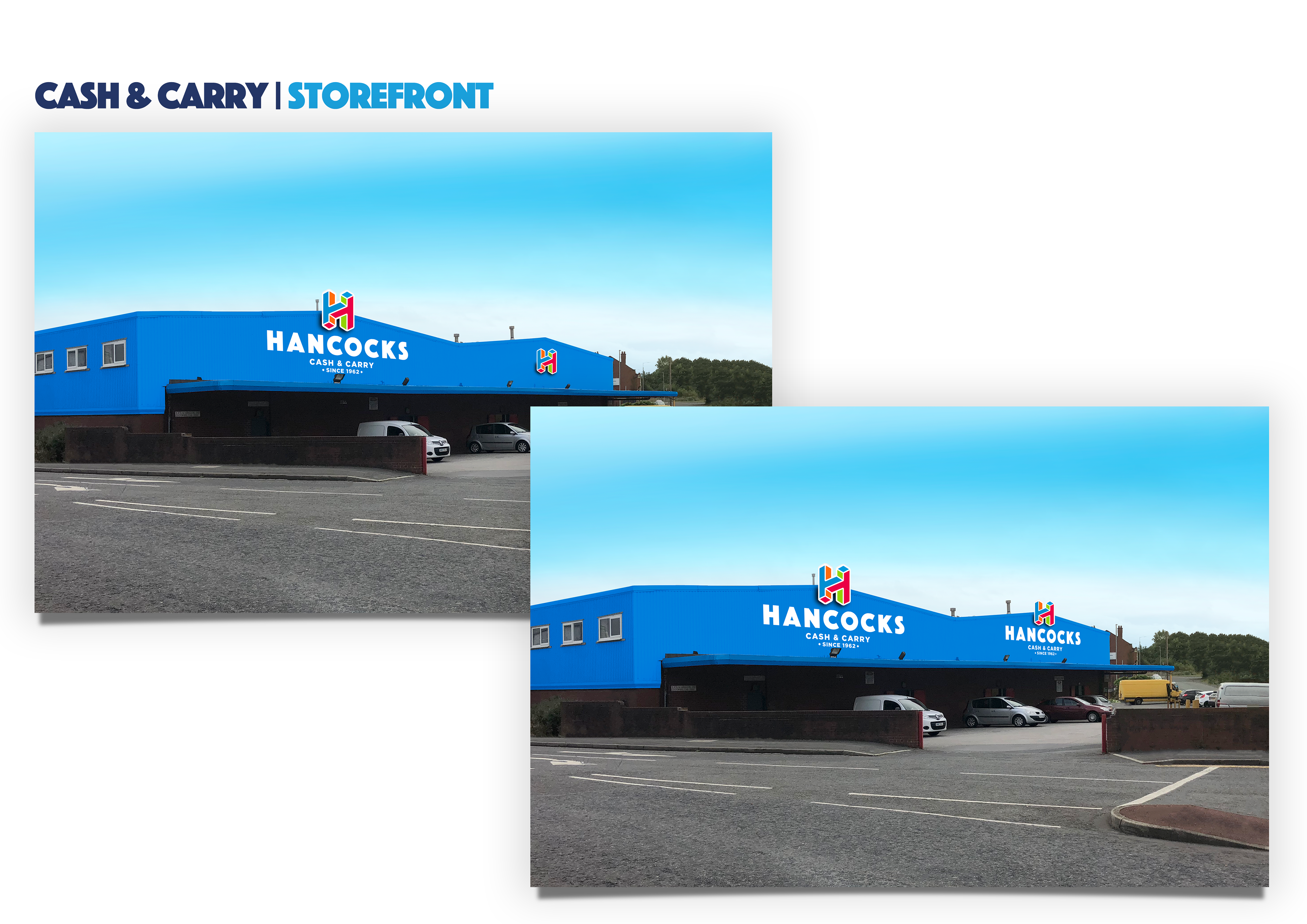
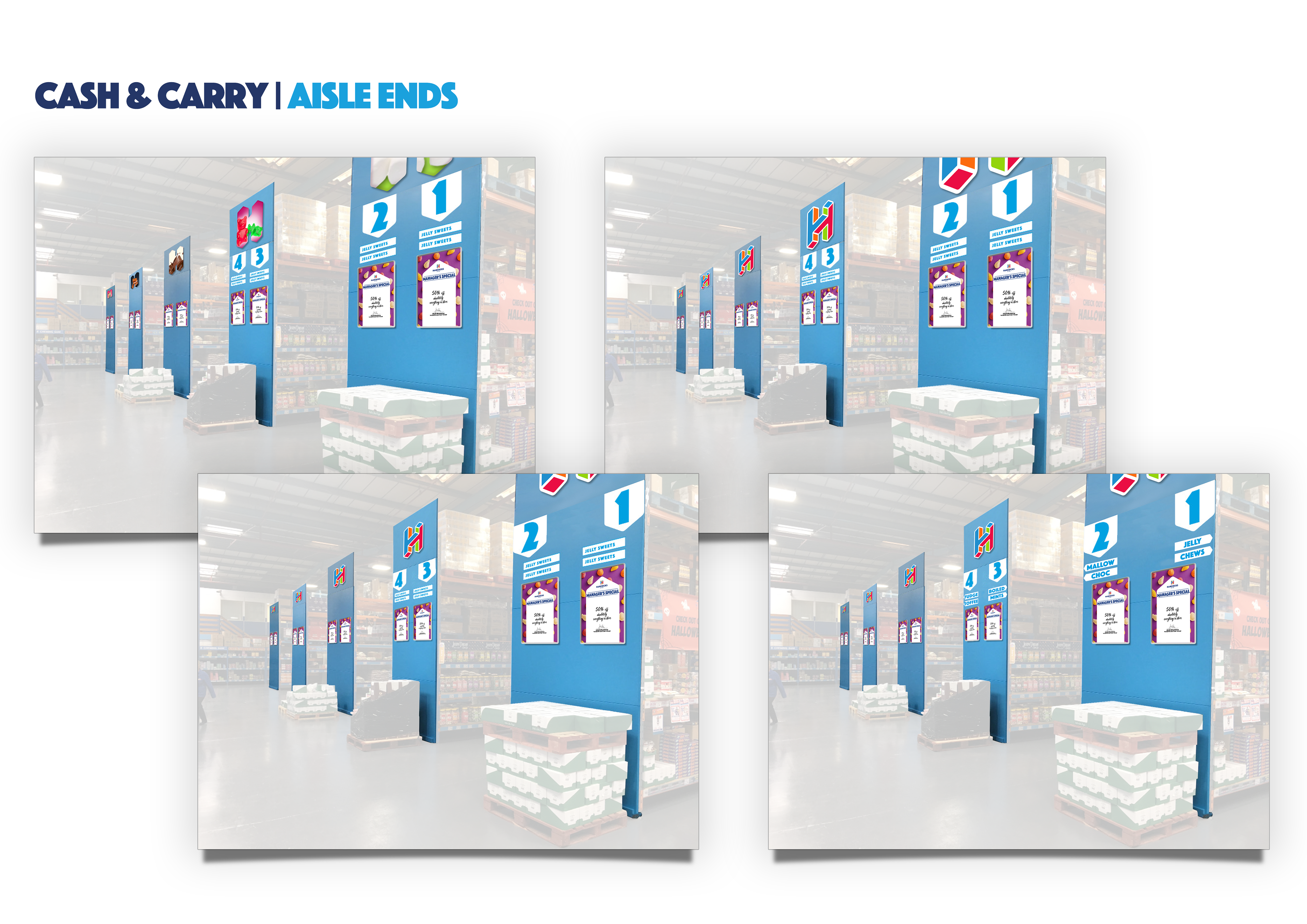
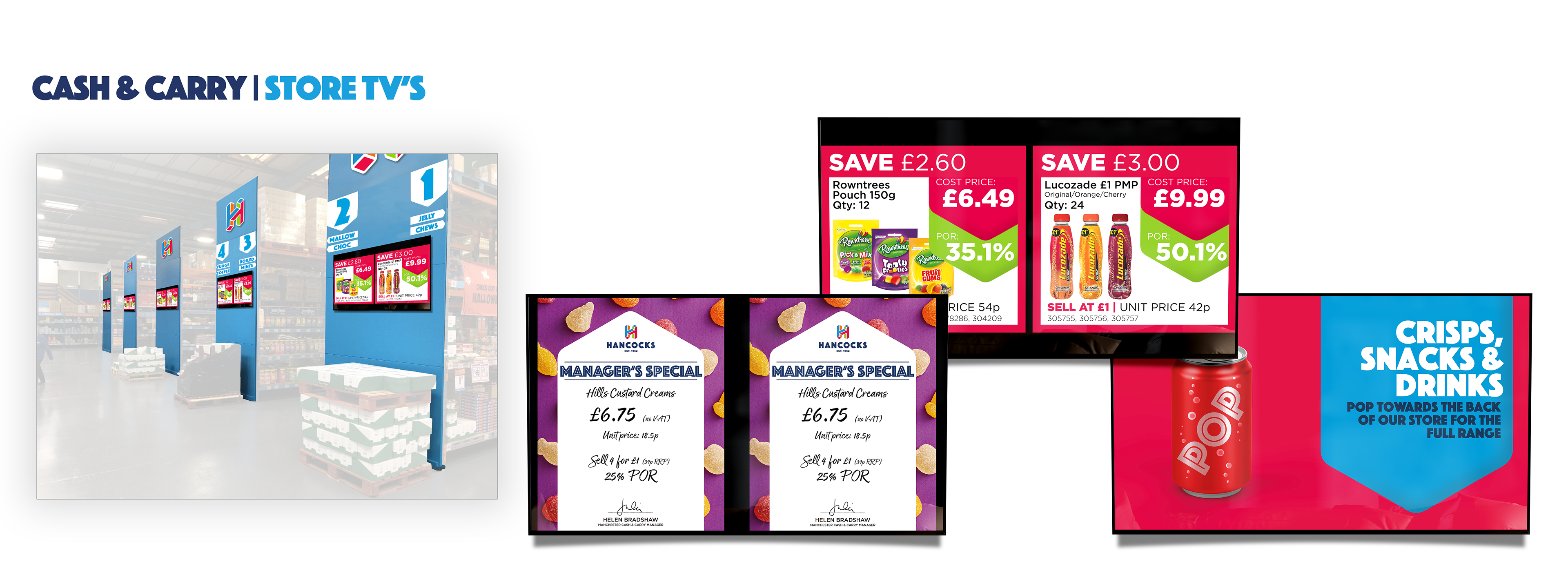
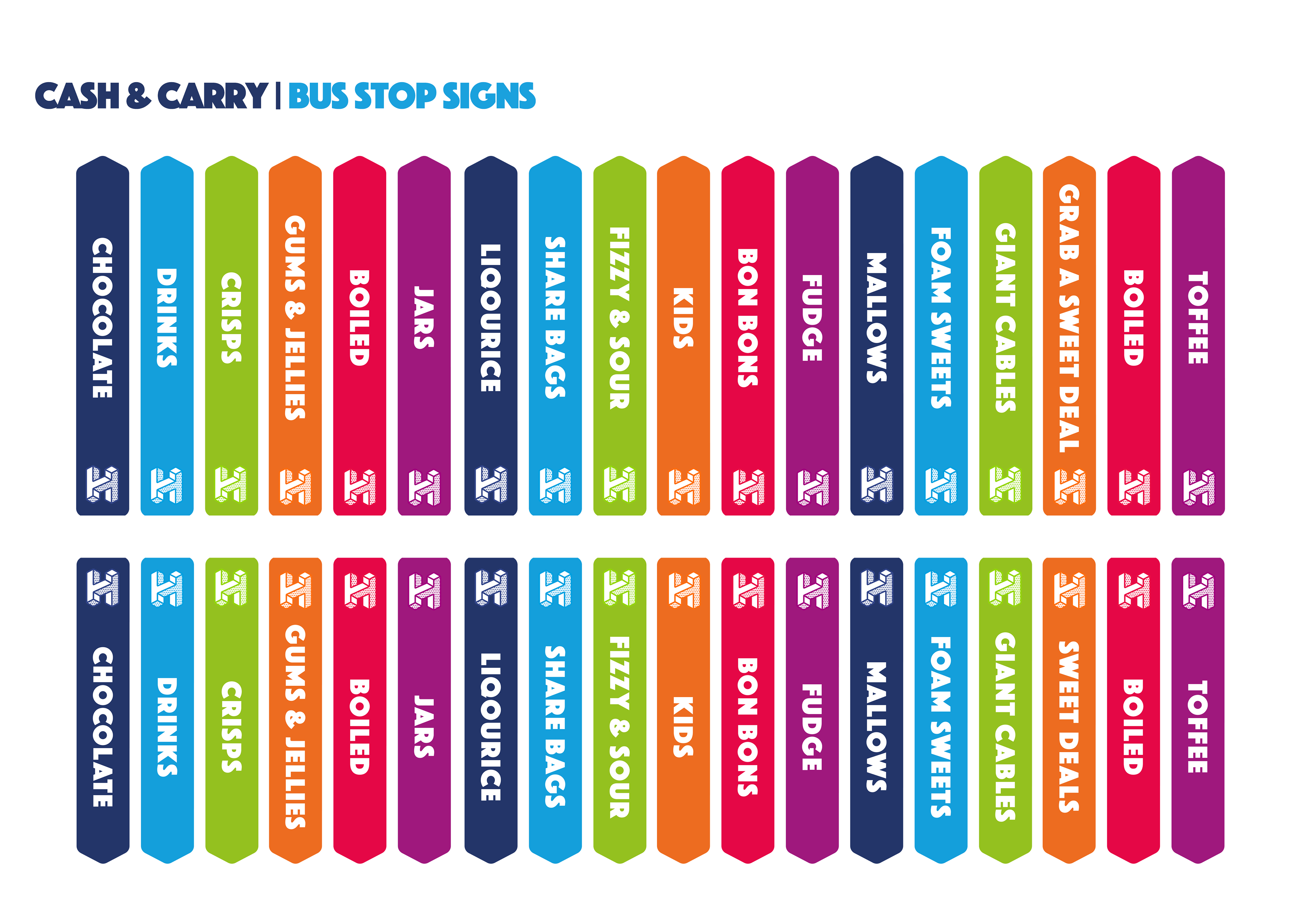
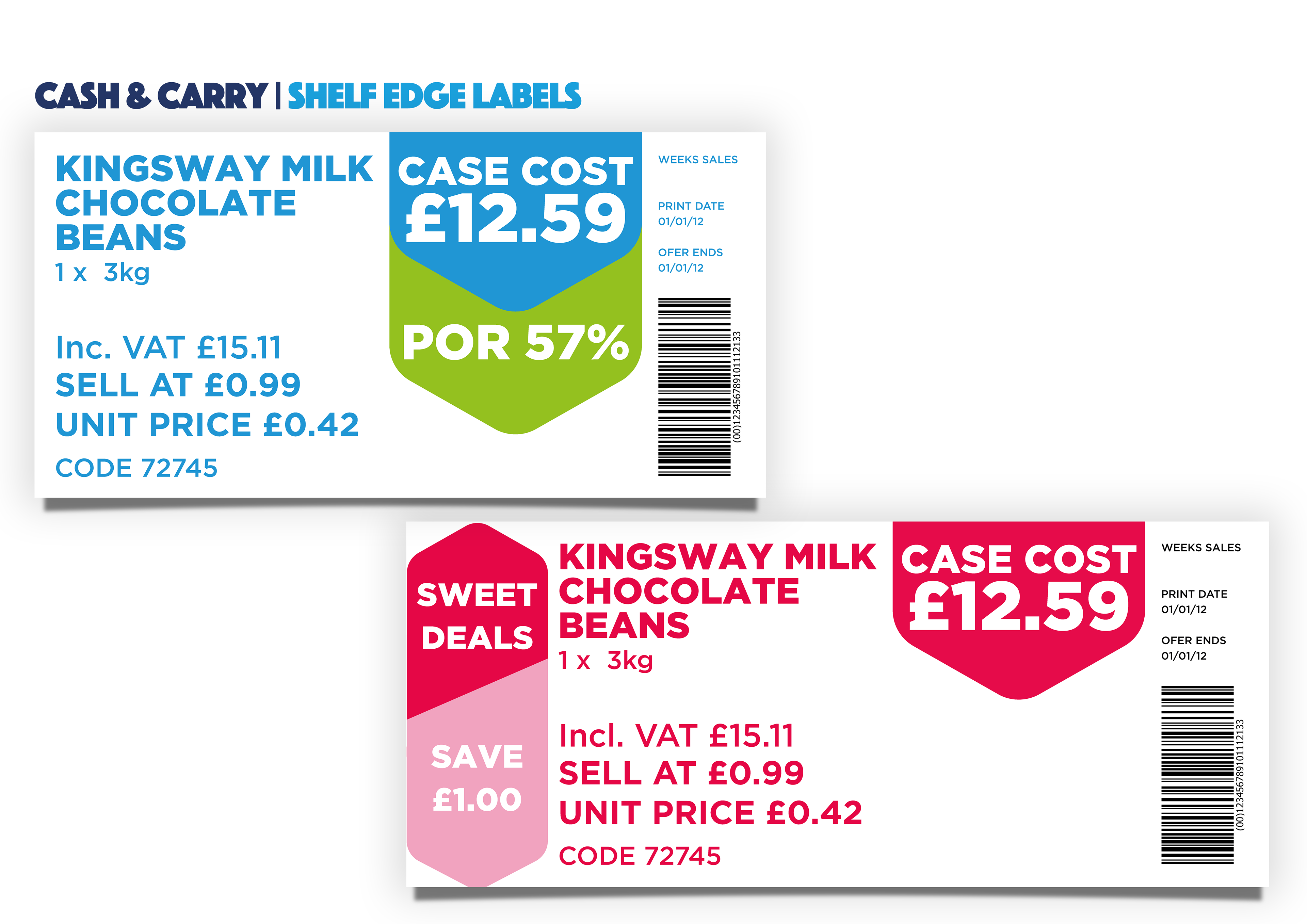
4. Improve store layouts, signage and point of sale to be engaging, informative and to a consistently high standard.
5. Highlight the Hancocks own brands and their high standard of product.
6. Be innovative both in product development and new products as well as usage of technology throughout the stores.
7. Embrace digital, provide an inclusive omni-channel marketing strategy that supports both online and in-store sales.
Throughout the project I worked alongside another designer within the Hancocks team, visited and liaised with the brand agency, and maintained communication with key stake holders within the Hancocks marketing, sales and ecommerce teams. Once the brand guidelines were established, we collaborated to bring the brand to life; ensuring that the brand evolved and can shape it's own future instead of getting left behind.
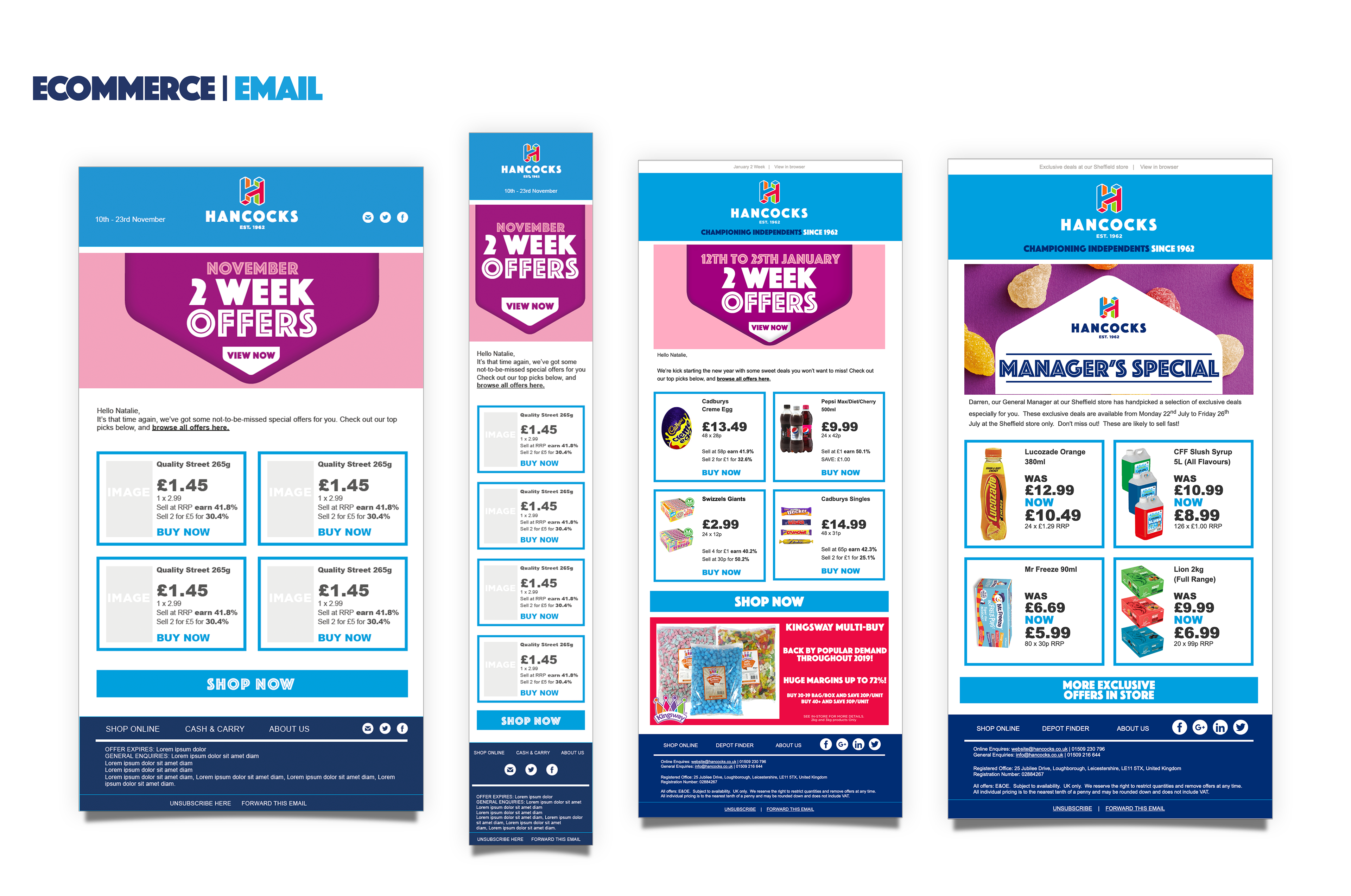
Rebrand Assets and Mockups


Final Thoughts
I believe that the Hancocks rebrand was highly successful providing a fresh new look. The colourful new brand guidelines helped support the company in showcasing the excitement and fun of the confectionery industry. As the company has a strong heritage and a wealth of experience within confectionery, it was important that this was provided through more product information and the staff being open, honest experts in their field. Within the rebrand it was intended to highlight this with the new uniforms as well as offering as much information as possible within the online and in-store POS. The end results created an environment that was organised and easy to shop, whist also highlighting the progressive nature of the brand through the use of technology and a unity between store and online. The positivity of the rebrand should help engage with both the employees and customers, encouraging the company to show they care and provide the best service and deals within fun environment.